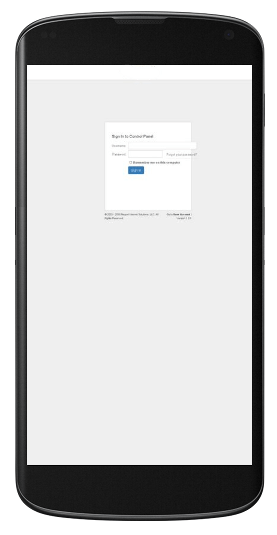
I have tested the page login in Google Mobile-Friendly Test and I get this result:
Page appears not mobile-friendly:
Text too small to read
Links too close together
Mobile viewport not set
Attach a screenshot for more details.

Hello,
Thank you for the report.
The Mobile layout indeed needs some further work, login is on schedule same as changing some of the tiny icon buttons.
The Login fix for mobile layout should be ready within end this week (mainly css adjustments, so should be an easy update once ready).
Regards,
Marco
Small edit:
For a quick fix you can add:
'<meta name="viewport" content="width=device-width, initial-scale=1, maximum-scale=1">' (without quotes) to default.aspx in the portal directory in the "header" section.
It's still not 100% good looking but atleast it's not scaled out and more useable.
I will have a more all round fix available within the next few days.
I have finished the fix for properly working login to solidcp.
you can download: http://installer.solidcp.com/Files/1.0.1/SolidCP-Portal-1.0.1.zip
unzip and copy + replace the directories:
App_Themes
App_Skins
Then copy + Replace the following files:
default.aspx
DesktopModulesSolidCPLogin.ascx
Or wait untill a official full update has been released (in about 2 to 3 weeks)
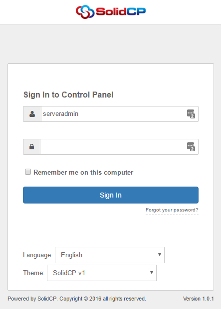
A screenshot of the redesign (from android v5 – chrome):

Thank you!
I have updated your new package and working fine!

